Signify Guides
Signify Analytics: Track Digital Business Card Views, Leads, and Saves
Signify Analytics helps you understand how people interact with your digital business cards. Review card views, incoming leads, contact saves, monthly activity, and conversion rates to get a clearer picture of your professional networking and engagement.
Signify Analytics is a Pro feature. It provides an overview of recorded activity for your selected digital business card, including how often people view it, save its details, and send leads.
How to Use Signify Analytics
The Analytics page brings your card's recorded engagement data together in one place. Start by choosing a card, review the summary totals, then explore the monthly charts and conversion funnel to understand how people are interacting with it.
Choose a Card to Review
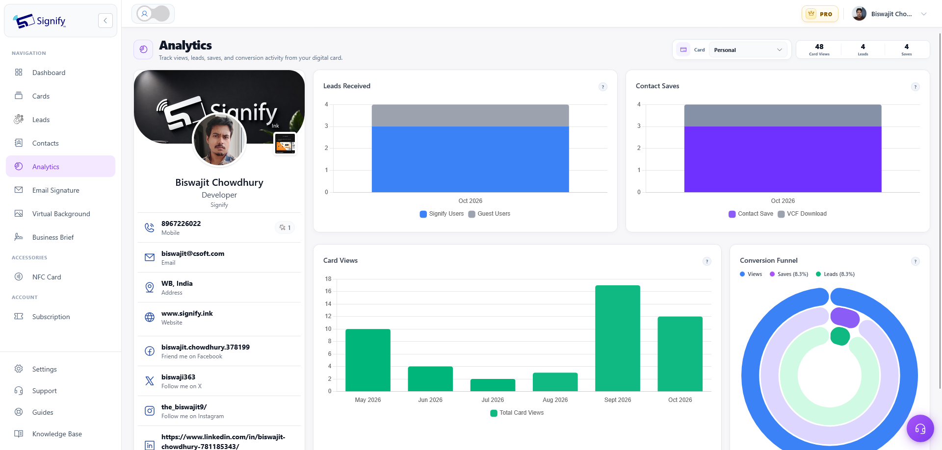
Use the Card selector at the top of the Analytics page to choose which Signify digital business card you want to examine.
When you select a different card, the summary figures, card preview, and charts update to reflect that card's recorded activity. The page also refreshes its figures automatically about every 30 seconds.
Understand Your Analytics Summary
The summary section displays three key totals for the selected card: Card Views, Leads, and Saves. These figures represent the recorded history currently available for that card.
Card Views
Card Views shows the total number of recorded views of your public Signify card. It counts views, not unique people, so it should not be interpreted as the number of different individuals who have seen your card.
Leads
Leads shows the number of leads received for the selected card. Leads can come from Signify users sharing their own cards or from guests submitting their contact details without a Signify account.
Saves
Saves counts recorded instances of visitors saving the card or downloading its contact details as a VCF file. These actions indicate ways people chose to keep your information for later.
Keep in mind: summary totals represent the recorded history currently available. They are not a count of unique people, and the page does not provide a date-range selector.
Explore Your Digital Business Card Preview
The Analytics page includes a preview of the selected card on the left side of the dashboard. It shows your digital business card as visitors see it, helping you connect the engagement figures with the information people interact with.
Some contact fields may display a count beside them. These counts represent recorded interactions with individual fields, such as a phone number, email address, or website link.
Fields without recorded interactions do not display a count. The preview can therefore help you identify which available contact options have received recorded engagement.
How to Read the Signify Analytics Charts
The charts break recorded activity down by month so you can explore changes in engagement over time. The months follow your local time zone.
If your analytics cover many months, the charts may extend horizontally. Scroll horizontally to view months that are not currently visible.
1. Leads Received
The Leads Received chart uses stacked monthly bars to distinguish between two lead sources:
- Blue: leads sent by Signify users using their own Signify cards.
- Gray: guest leads submitted by people without a Signify account.
Each month's full bar combines both categories. Hover over a bar to see the recorded counts and understand how much of that month's activity came from Signify users versus guests.
2. Contact Saves
The Contact Saves chart uses stacked monthly bars to show how visitors kept your card's information.
- Purple: contact saves.
- Gray: VCF downloads.
This breakdown helps you understand the recorded mix of people saving your contact and people downloading a VCF file. Each monthly bar combines both categories.
3. Card Views
The Card Views chart shows the total recorded views for each month. Each green bar represents that month's views.
Taller bars indicate more recorded views during a particular month. Comparing the bars can help you identify periods when your digital business card received more or less attention.
4. Conversion Funnel
The Conversion Funnel compares recorded card views with saves and leads. It uses three rings to present the view baseline and the two engagement rates.
- Blue ring: the 100% card-view baseline.
- Purple ring: the save rate.
- Green ring: the lead rate.
The rates are calculated by comparing the number of saves and leads with the number of recorded views.
Save rate = saves ÷ views × 100
Lead rate = leads ÷ views × 100
For example, a 10% save rate means recorded saves equal one tenth of the recorded views used in the calculation. The lead rate applies the same principle to leads.
These rates provide a way to compare how often recorded views are accompanied by saves or leads. They are aggregate ratios, not proof that each save or lead came from a different visitor.
What Signify Analytics Does Not Currently Show
Signify Analytics focuses on aggregate engagement and interactions with card fields. It does not currently provide a breakdown by visitor location, device, or demographic information.
This means you can use the available metrics to review overall activity and engagement patterns, but you cannot use this page to determine where visitors are located, which devices they use, or their demographic characteristics.
The charts also follow the recorded monthly history available to the selected card. There is no date-range selector, so use horizontal scrolling to explore older or less visible months when the charts extend beyond the screen.
Tips for Getting More from Signify Analytics
- Select the correct card: review each card individually because the summary totals and charts update based on your selection.
- Compare activity over multiple months: use the monthly charts to spot periods with higher or lower views, saves, or leads.
- Review lead sources: compare Signify user leads with guest leads to understand where recorded leads are coming from.
- Look at save behavior: compare contact saves with VCF downloads to see how visitors keep your information.
- Consider the conversion rates in context: review save and lead rates alongside total views rather than interpreting percentages in isolation.
- Remember what views measure: card views are recorded views, not unique individuals.
Signify Analytics FAQ
Is Signify Analytics free?
No. Signify Analytics is available with Signify Pro.
What does Card Views count?
Card Views counts recorded views of your public digital business card. It counts views, not unique people.
What is included in Saves?
Saves counts recorded instances of visitors saving the card or downloading its contact details as a VCF file.
What is the difference between Signify user leads and guest leads?
Signify user leads are sent using a Signify user's own card. Guest leads are submitted by people without a Signify account using manually entered contact details.
How often does the Analytics page refresh?
The Analytics page refreshes its figures automatically about every 30 seconds.
Why do the charts show different monthly activity?
Each chart represents a different type of recorded activity. Leads Received separates Signify user leads from guest leads, Contact Saves separates contact saves from VCF downloads, and Card Views shows monthly view totals.
How is the save rate calculated?
The save rate is calculated by dividing saves by views and multiplying by 100. For example, a 10% save rate means recorded saves equal one tenth of the recorded views used in the calculation.
How is the lead rate calculated?
The lead rate is calculated by dividing leads by views and multiplying by 100.
Can I filter Analytics by date range?
There is no date-range selector on the Analytics page. The charts show monthly activity, use your local time zone, and may require horizontal scrolling to view all available months.
Can I see visitor locations or devices in Analytics?
Not currently. Signify Analytics focuses on aggregate engagement and card-field interactions rather than location, device, or demographic breakdowns.
Understand How Your Digital Business Card Performs
Signify Analytics brings together card views, leads, saves, field interactions, and conversion rates to help you review how people engage with your professional profile.
Explore your card's recorded activity with Signify Pro and use the monthly insights to make more informed decisions about how you share your digital business card.